Chronode provides reporting to help you understand your work patterns and time allocation. All reports update in real-time and include currently active sessions.
Time Range Selection
All charts support flexible time range filtering:
Available ranges:
- Today: Current day only
- 7 Days: Last week including today
- 30 Days: Last month including today
- 90 Days: Last quarter including today
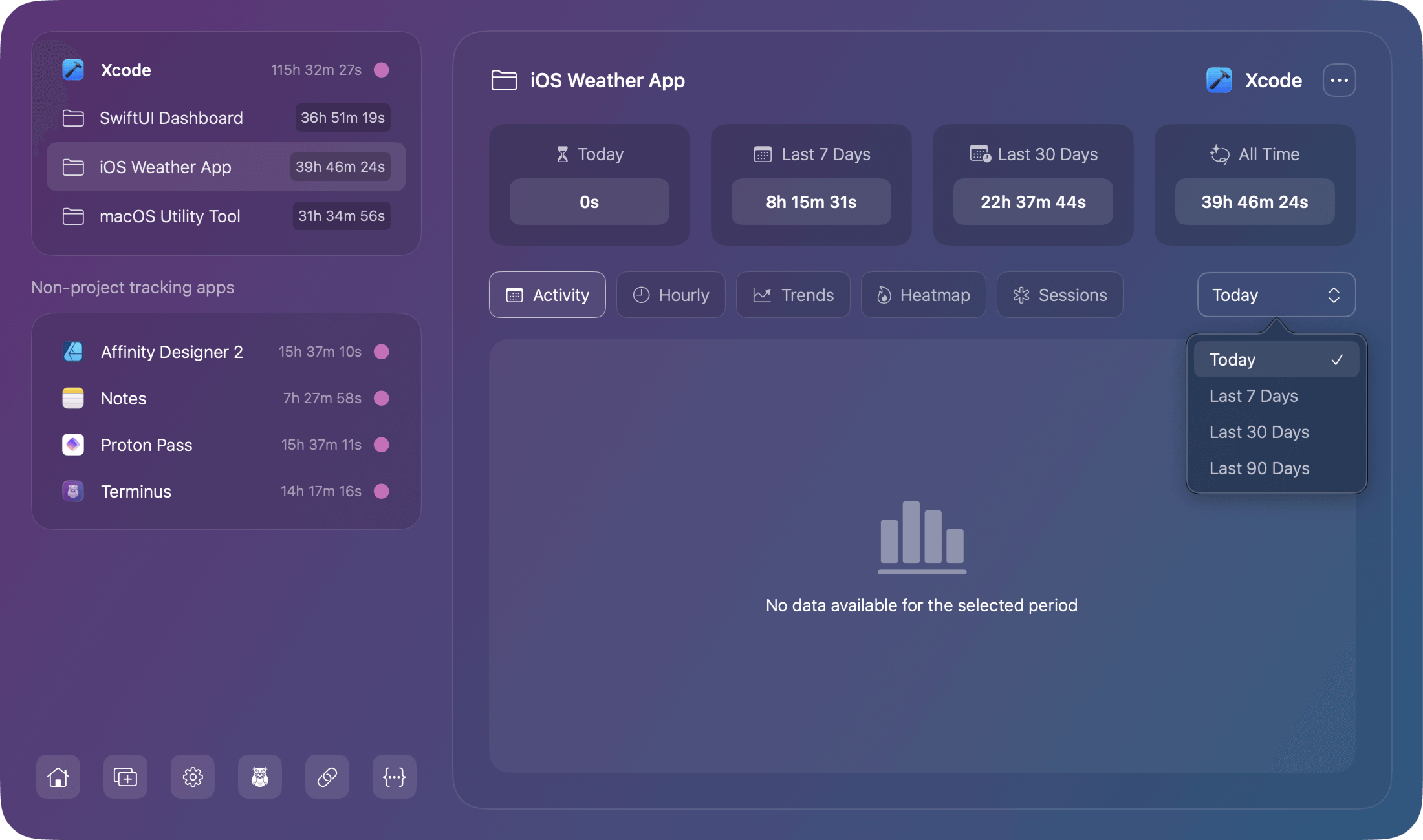
Note: Some charts may show no data available in certain time ranges if the data density makes them impractical.
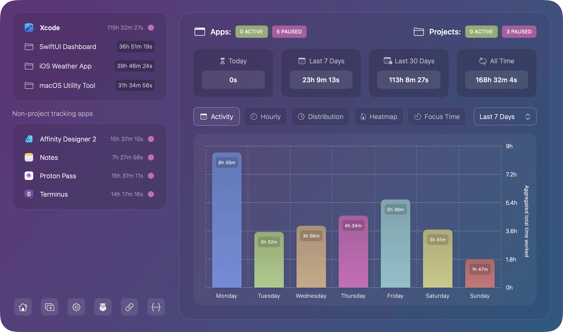
Activity Chart
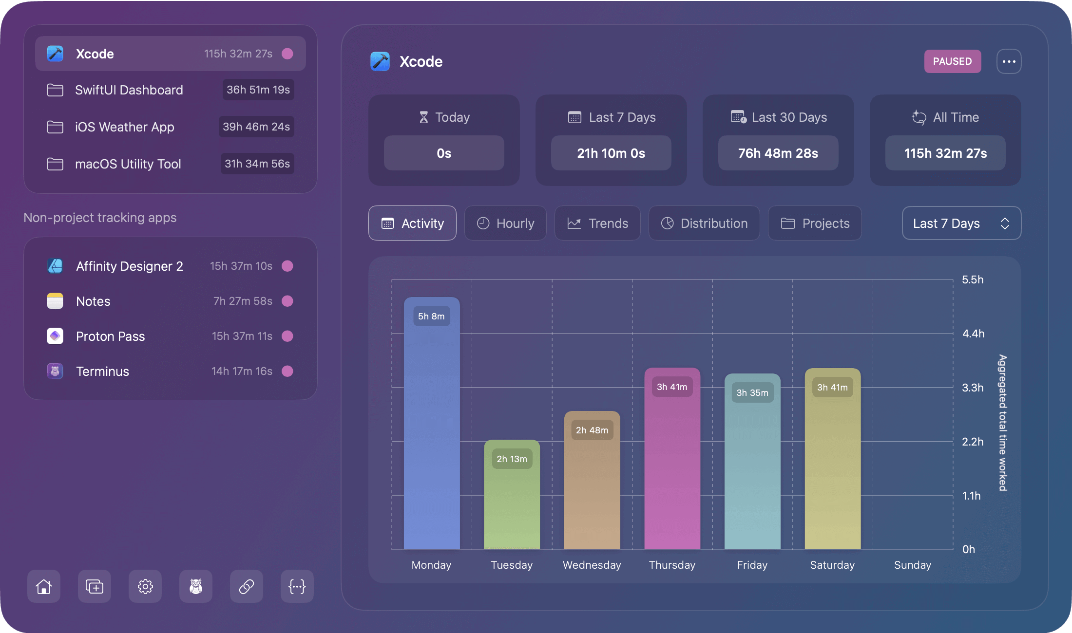
Shows your daily work time aggregated by day of the week across your selected time range.
How to Read It
- X-axis: Days of the week (Mon-Sun)
- Y-axis: Total hours worked
- Bars: Color coded by weekday from the Chronode color palette
- Height: Represents aggregated time for that weekday across the time range
- Duration labels: Shown inside bars for exact times
What It Reveals
- Weekly patterns: Which days you typically work most
- Work distribution: Balance across the week
- Trends: Changes in daily work patterns over time
Example insights:
- "I work heaviest on Wednesdays"
- "Weekends are mostly off"
- "Friday productivity drops"
Hourly Productivity Chart
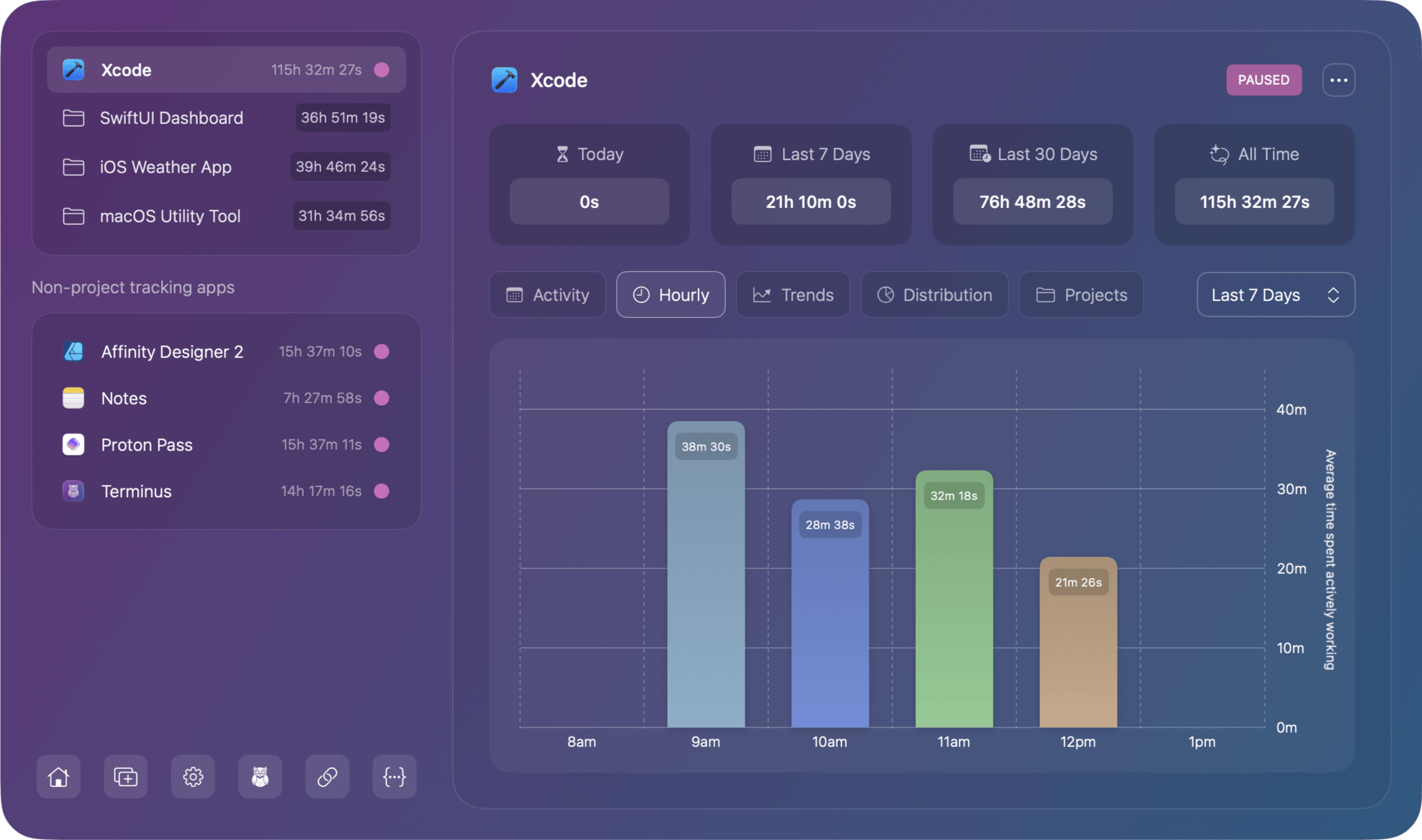
Shows which hours of the day you're most productive by totaling all work time that occurred during each hour:
How to Read It
- X-axis: Hours of the day (24-hour format or AM/PM)
- Y-axis: Accumulated time during that hour
- Bars: Dynamic width based on relevant hours (only shows hours with activity)
- Colors: Gradient effects for visual hierarchy
What It Reveals
- Peak hours: When you do your best work
- Energy patterns: Morning vs. afternoon vs. evening productivity
- Schedule optimization: Best times to plan focused work
Example insights:
- "I'm most productive 10 AM - 12 PM"
- "Post-lunch dip around 2 PM"
- "Late evening work sessions on Tuesdays"
Project Distribution Chart
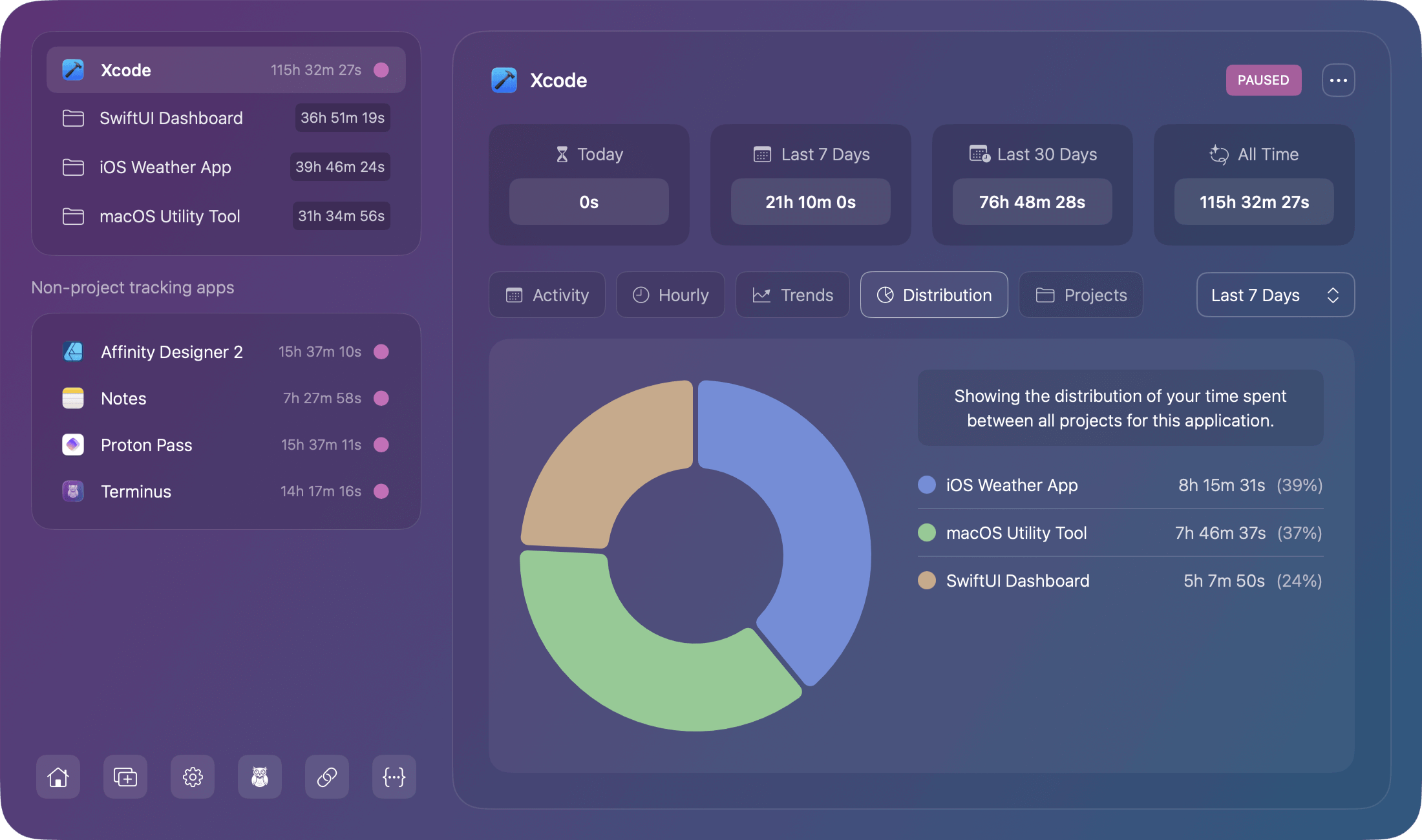
A pie chart visualization showing what percentage of your total time went to each project:
Layout
- Pie chart (left side): Visual representation of time split
- Legend (right side): Project names with percentages and hours
- Colors: Unique color for each project
- Hover states: Interactive tooltips with details
How to Read It
- Larger slices: Projects consuming more time
- Percentages: Proportion of total tracked time
- Absolute hours: Actual time spent (shown in legend)
What It Reveals
- Time allocation: Where most work hours go
- Project balance: Is time distributed as intended?
- Focus areas: Which projects dominate your schedule
Example insights:
- "Client A takes 60% of my time"
- "Personal projects only get 10%"
- "Need to rebalance project workload"
Trend Analysis Chart
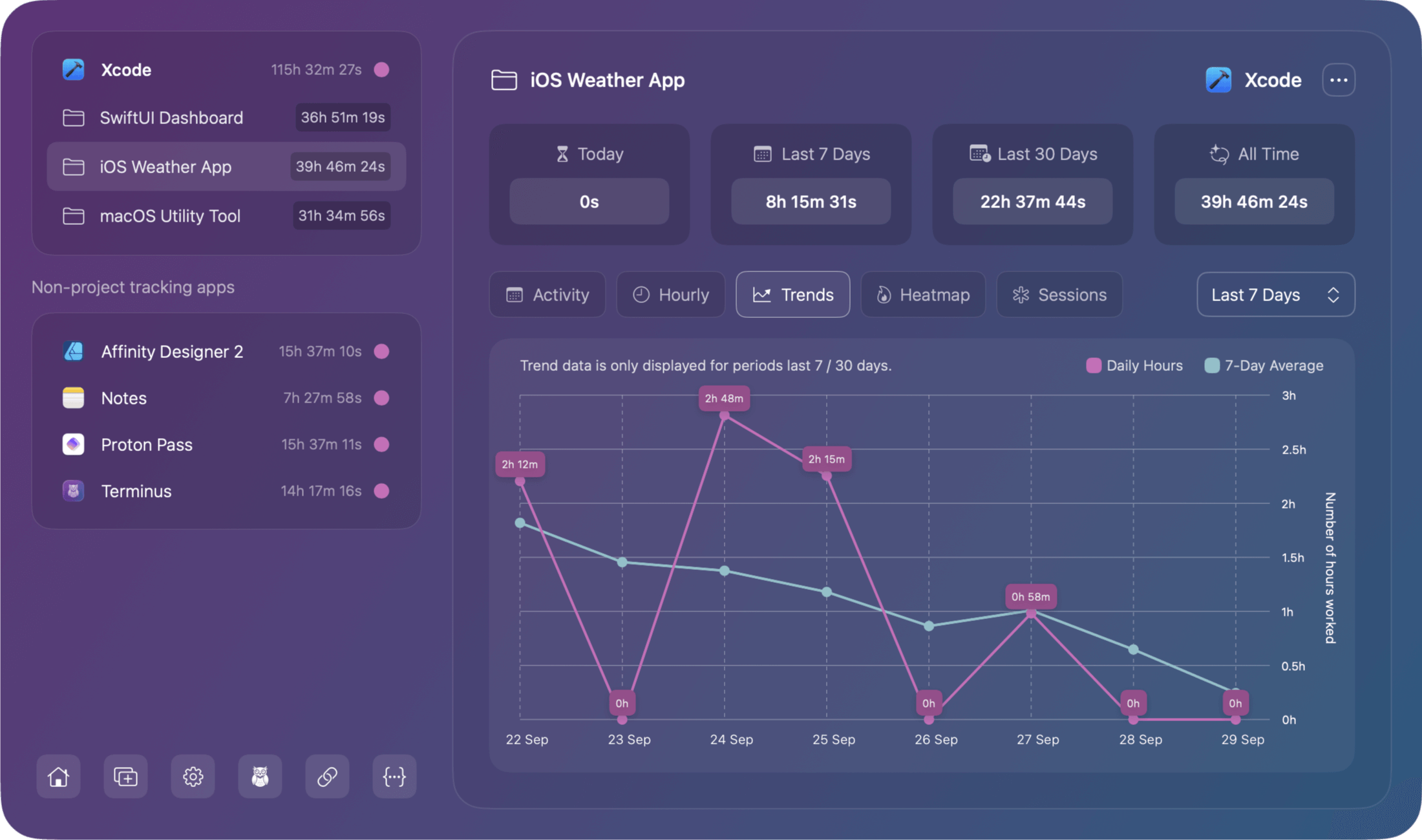
A line graph showing total hours worked each day with a 7-day average smoothed trend line to reveal patterns:
How to Read It
- X-axis: Days in chronological order
- Y-axis: Hours worked per day
- Line: Daily actual values (may be jagged)
- Trend line: 7-day moving average (smoothed)
- Annotations: Markers for significant events
Available Time Ranges
- 7 Days: Shows daily progression
- 30 Days: Monthly patterns with trend
- 90 Days: Quarterly trends and cycles
Note: Not available for "Today" view (insufficient data for trends)
What It Reveals
- Consistency: How stable your work patterns are
- Trends: Are you working more or less over time?
- Anomalies: Unusual days (very high or low)
Example insights:
- "Trending upwards indicates working more lately"
- "Inconsistent schedule with big swings"
- "Steady 8-hour days most of the time"
Activity Heatmap
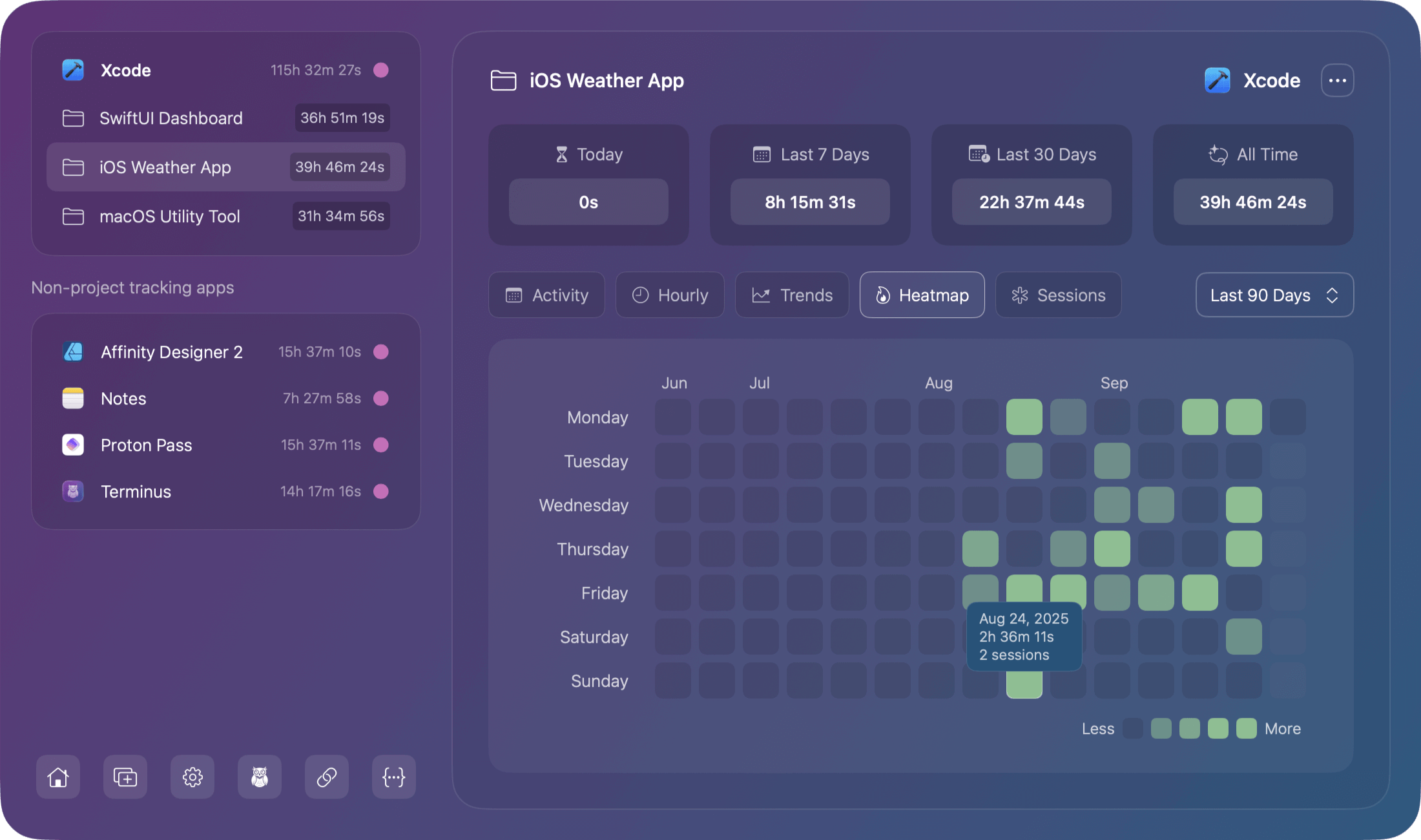
A GitHub-style contribution calendar showing work intensity where each cell represents a day, colored by how much work was done:
How to Read It
- Rows: Weeks (each row is one week)
- Columns: Days of the week (Mon-Sun)
- Color intensity: Darker = more hours worked that day
- Hover: Shows exact date and time worked
Visual Language
Color intensity scale:
- No color/empty: 0 hours (no work)
- Light: 1-2 hours
- Medium: 2-4 hours
- Dark: 4-6 hours
- Darkest: 6+ hours
What It Reveals
- Work patterns: Consistent daily work vs. sporadic
- Streaks: Consecutive working days
- Gaps: Days off, vacations, breaks
- Motivation: Visual progress like GitHub contributions
Example insights:
- "Solid work streak for two weeks"
- "Weekends are consistently off"
- "Big gap last week due to being on vacation"
Focus Time Chart
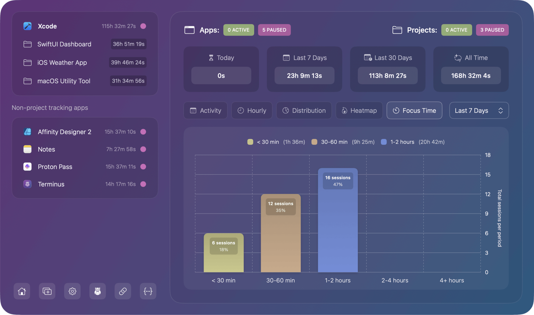
A Bar chart showing a distribution of your session lengths indicating how long you typically work in single sessions.
How to Read It
- X-axis: Session duration categories
- Y-axis: Number of sessions in each category
- Colors: Unique color per category with gradients
- Height: Number of sessions matching that duration
What It Reveals
- Work style: Short bursts vs. long focused sessions
- Attention span: How long you can maintain focus
- Session planning: Optimize work blocks based on patterns
Session Categories
| Category | Duration | Typical Use |
|---|---|---|
| < 30 min | Under 30 minutes | Quick tasks, brief sessions |
| 30-60 min | 30 min to 1 hour | Standard work sessions |
| 1-2 hours | 1 to 2 hours | Focused session blocks |
| 2-4 hours | 2 to 4 hours | Deep work sessions |
| 4+ hours | Over 4 hours | Marathon work session |
Example insights:
- "Most sessions are 1-2 hours indicating optimal focus time"
- "Too many brief sessions could mean lots of interruptions"
- "Marathon sessions every Friday. You probably need breaks!"
Sessions
The Sessions tab displays a detailed chronological list of all individual work sessions for the selected app or project. Unlike the aggregated views in other charts, Sessions shows you the exact start and end time of each session, giving you complete visibility into your work patterns.
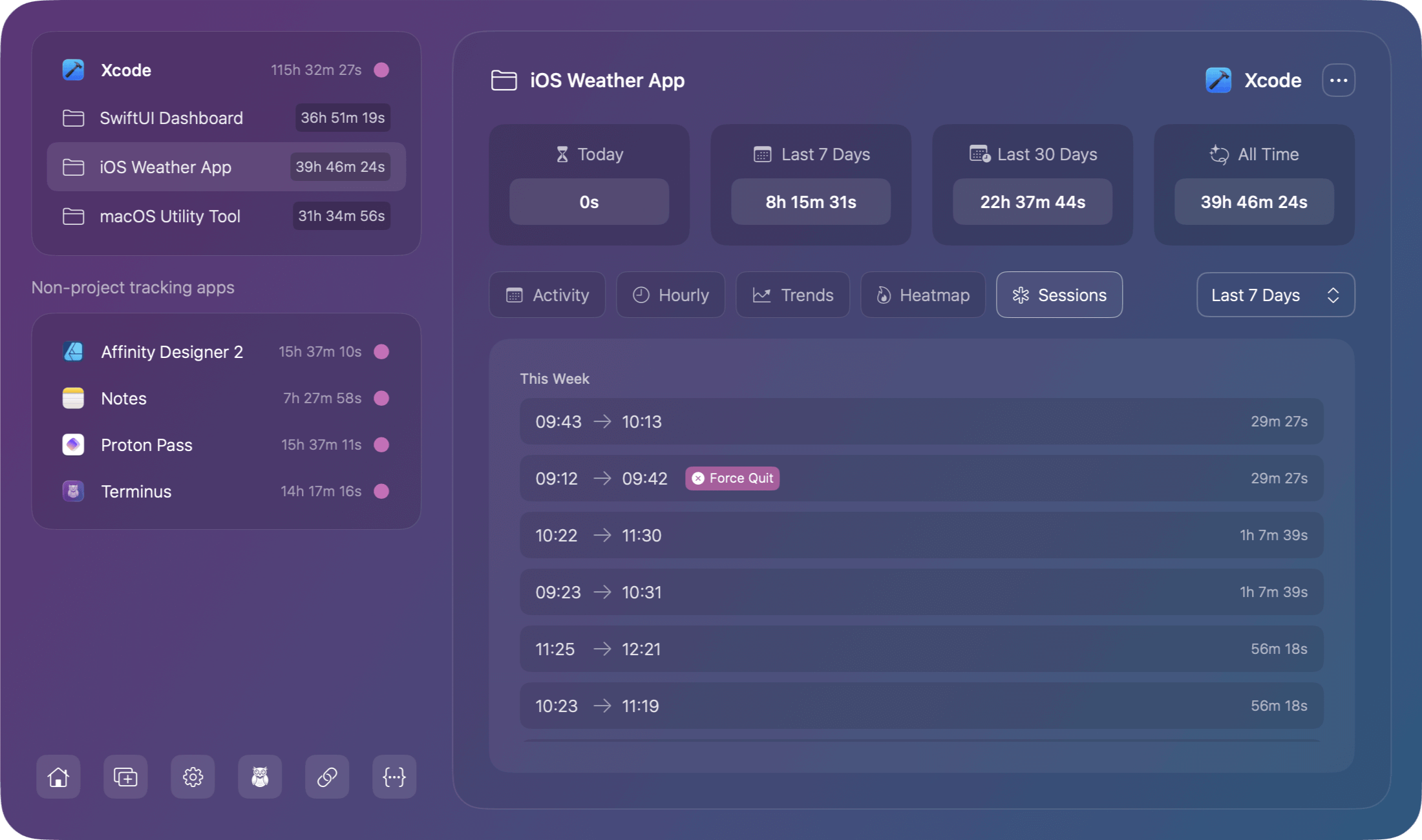
Each session displays:
- Start time - When the app was launched (e.g., 09:43)
- End time - When the app was quit or terminated (e.g., 10:13)
- Duration - Total time for that session, shown on the right (e.g., 29m 27s)
Special badges appear for abnormal session endings:
- Force Quit - The session ended via force quit
- Crash - The app crashed during the session
Active Sessions
All active sessions are included in the display and will show with an "Active" badge.
Time Range
The sessions shown are dependent on the time range filter selected.
Visibility
This tab is only visible when viewing the details of a project or a non-project supported application
Projects
The Projects tab shows a breakdown of all projects detected within the selected app, along with the total time tracked for each project.
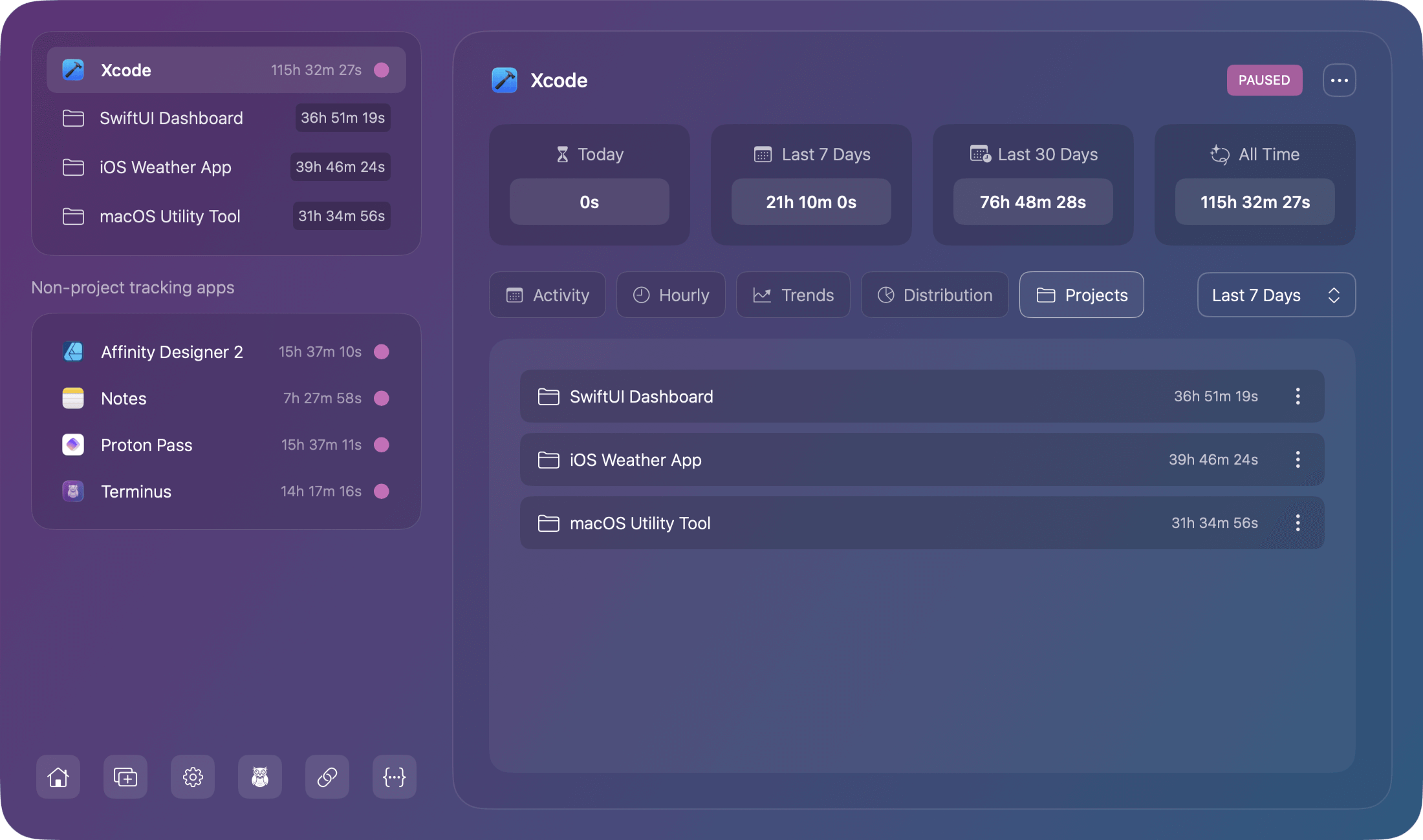
Each project displays:
- Project name
- Total time for that project in the selected time range
- Three-dot menu on the right for project-specific actions
This tab is only visible when viewing supported apps that can automatically detect projects. Non-supported apps won't show this tab since they only track total app time without project breakdowns.
Real-Time Updates
All charts include active sessions:
What this means:
- Currently running sessions appear in charts immediately
- Charts update approximately every 30 seconds
- No need to wait for sessions to complete
- Today's partial data is always visible
Example:
If you've been working for 3 hours today and are still in an active session:
- Activity Chart shows 3+ hours for today
- Hourly Productivity includes current hour
- Project Distribution counts active project time
- Calendar Heatmap colors today's cell
Empty States
If no data exists for a chart, you'll see an empty state message:
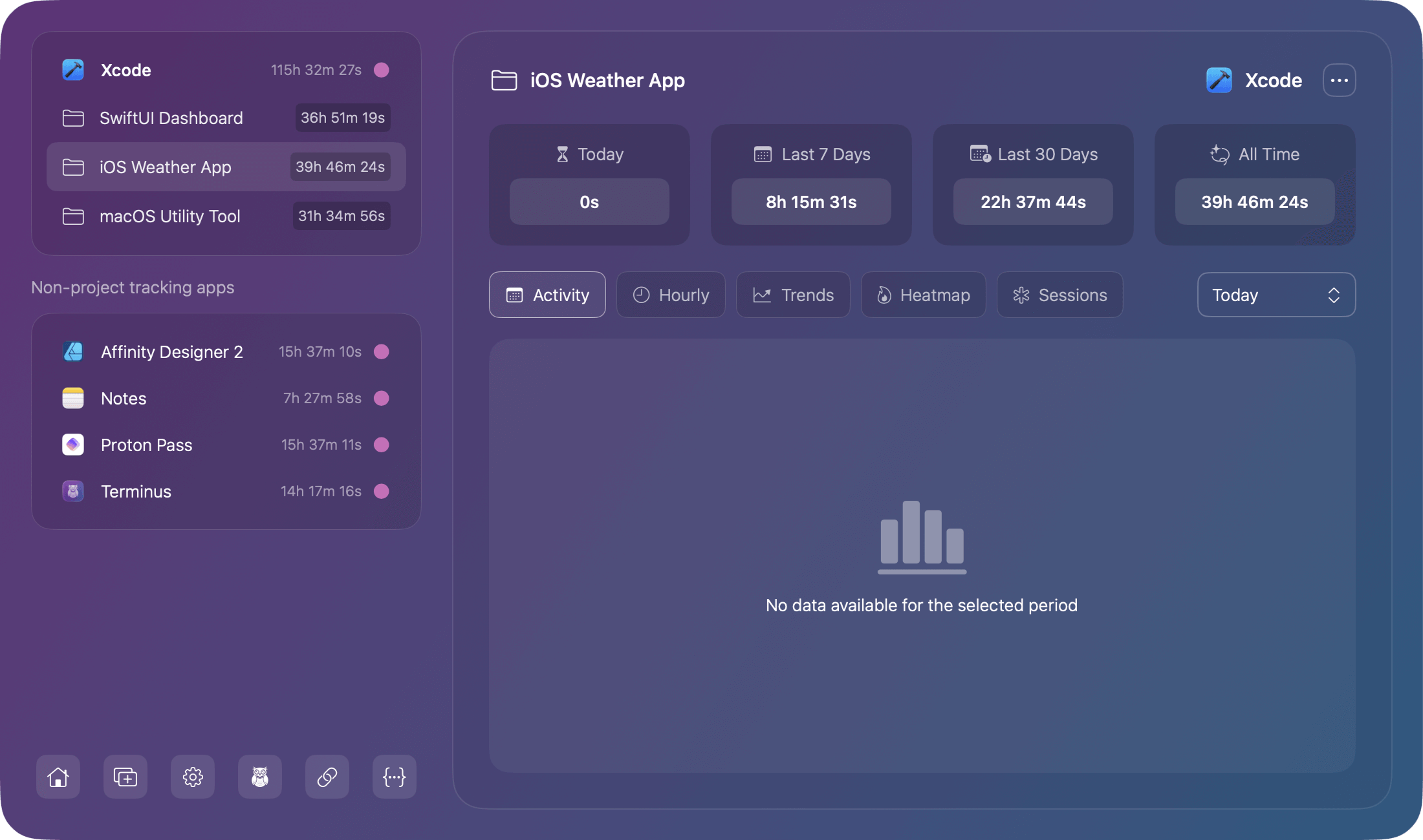
Common scenarios:
- No activity in selected time range
- App just installed (no historical data yet)
- Time range filter excludes all sessions
Solution: Change time range or continue working to accumulate data.
Using Charts for Insights
For Freelancers
- Prove time worked to clients (Trend Analysis)
- Show project time allocation (Project Distribution)
- Identify billable hours patterns (Hourly Productivity)
- Track work consistency (Calendar Heatmap)
For Remote Workers
- Demonstrate productivity to managers (Activity Chart)
- Optimize work schedule (Hourly Productivity)
- Track focus session quality (Focus Sessions)
- Show consistent work patterns (Calendar Heatmap)
For Personal Development
- Understand your productive hours (Hourly Productivity)
- Build consistent habits (Calendar Heatmap)
- Improve focus duration (Focus Sessions)
- Balance project time (Project Distribution)
